Summary
Business Case
Public transport riders make time-critical decisions in noisy, distracting contexts.
The city had been busy shipping feature-on-feature to transform it from a static, read-only app to a realtime route calculator. In the rush to deliver, UX had been an oversight - and users complained the app looked tired and messy.
To win back their users trust, the city engaged me to address this UX debt, and refactor their app’s design around a new transport tracking technology they hoped would improve rider confidence, reduce missed connections, and lower the pressure on call centres and social media support.
My Role
As Lead Design Contractor, I partnered closely with the Transport Authority’s Engineering, and Product heads over several weeks to:
- Conduct a rapid UX audit and heuristic evaluation.
- Define, prototype, and validate two “smart” features with low implementation risk.
- Create a compact design system update to reduce UI debt without a full re-platform.
User Profile
Primary users are daily commuters (students, shift workers, and office staff) who:
- Plan repeat trips under time pressure and often one-handed on the move.
- Need trustworthy “leave now / board here / make this transfer” guidance.
- Frequently switch between modes (bus today, train tomorrow) and need flexible, multi-modal support. Accessibility and simplicity were prioritized to serve the lowest common denominator of tech literacy.
Project Journey
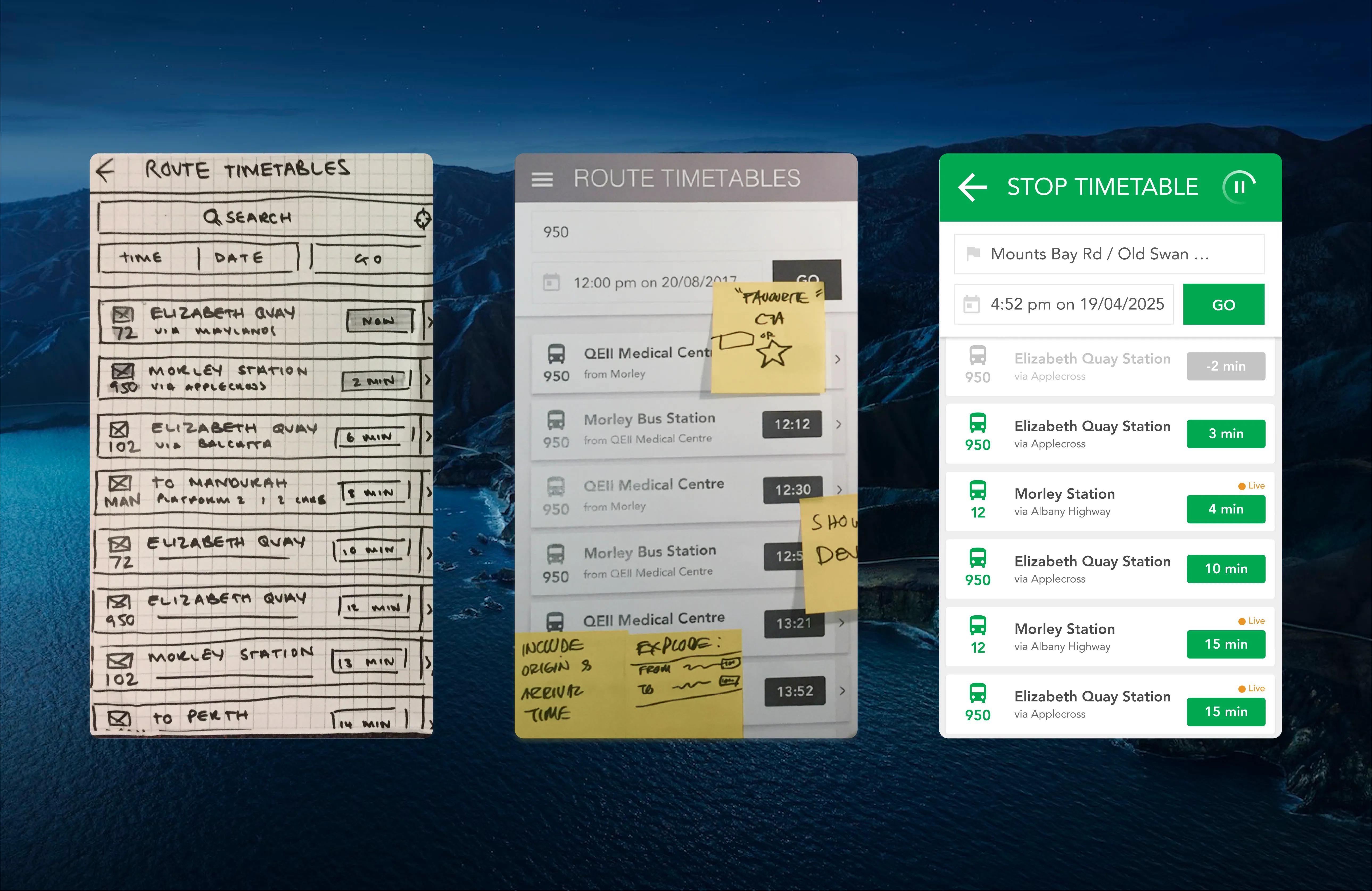
Working under tight budget and time constraints, paired with limited access to the public for research participation, we organised short, iterative fortnightly sprints leveraging internal users, domain experts, and pilot releases to de-risk our design decisions.
Design Solution
A glanceable, real-time transit companion that:
- Surfaces only what matters right now (next step, reliability, and exceptions).
- Works across buses today, extendable to trains and ferries tomorrow.
- Stays privacy-respectful and battery-console, with clear user control.
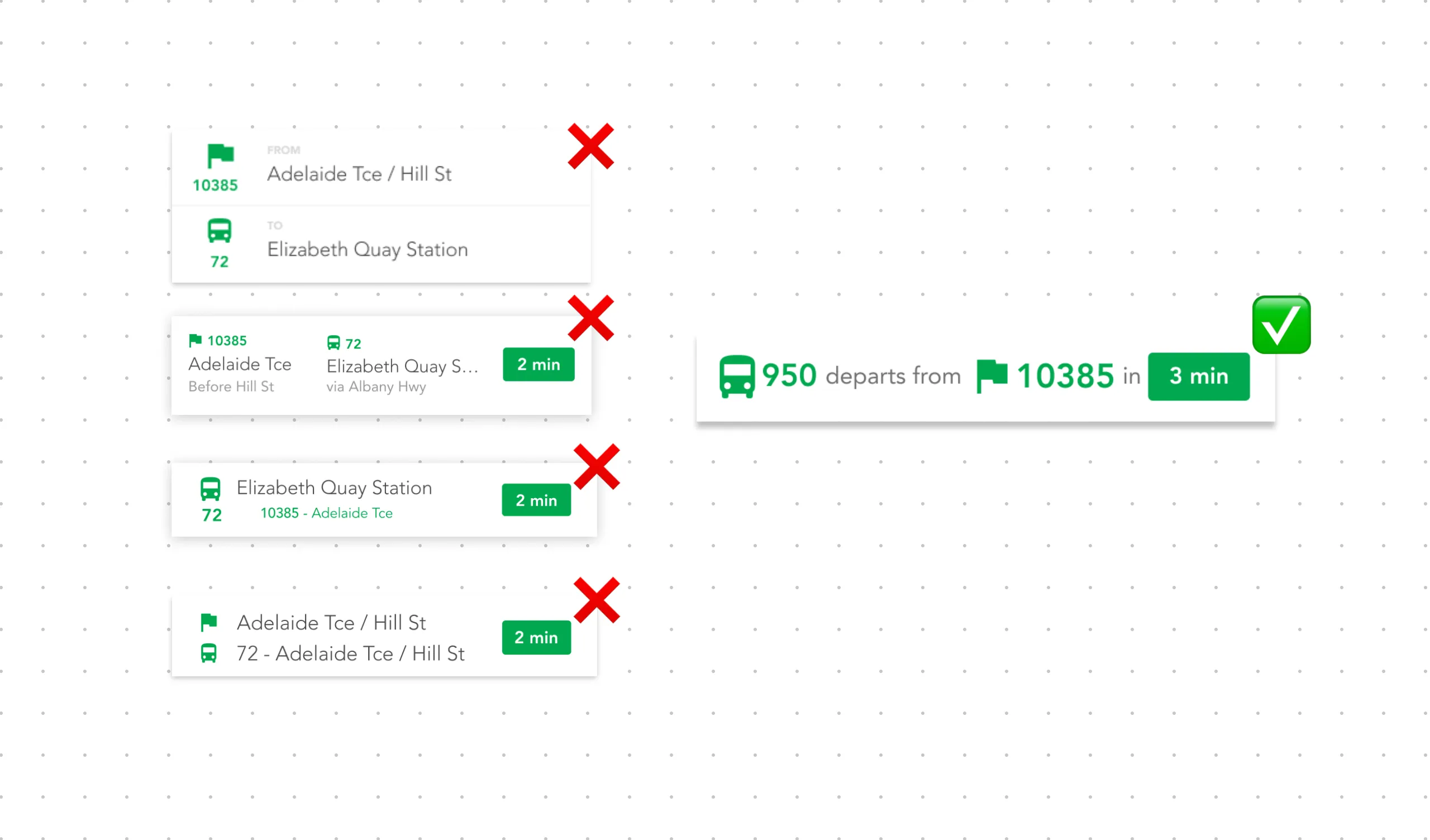
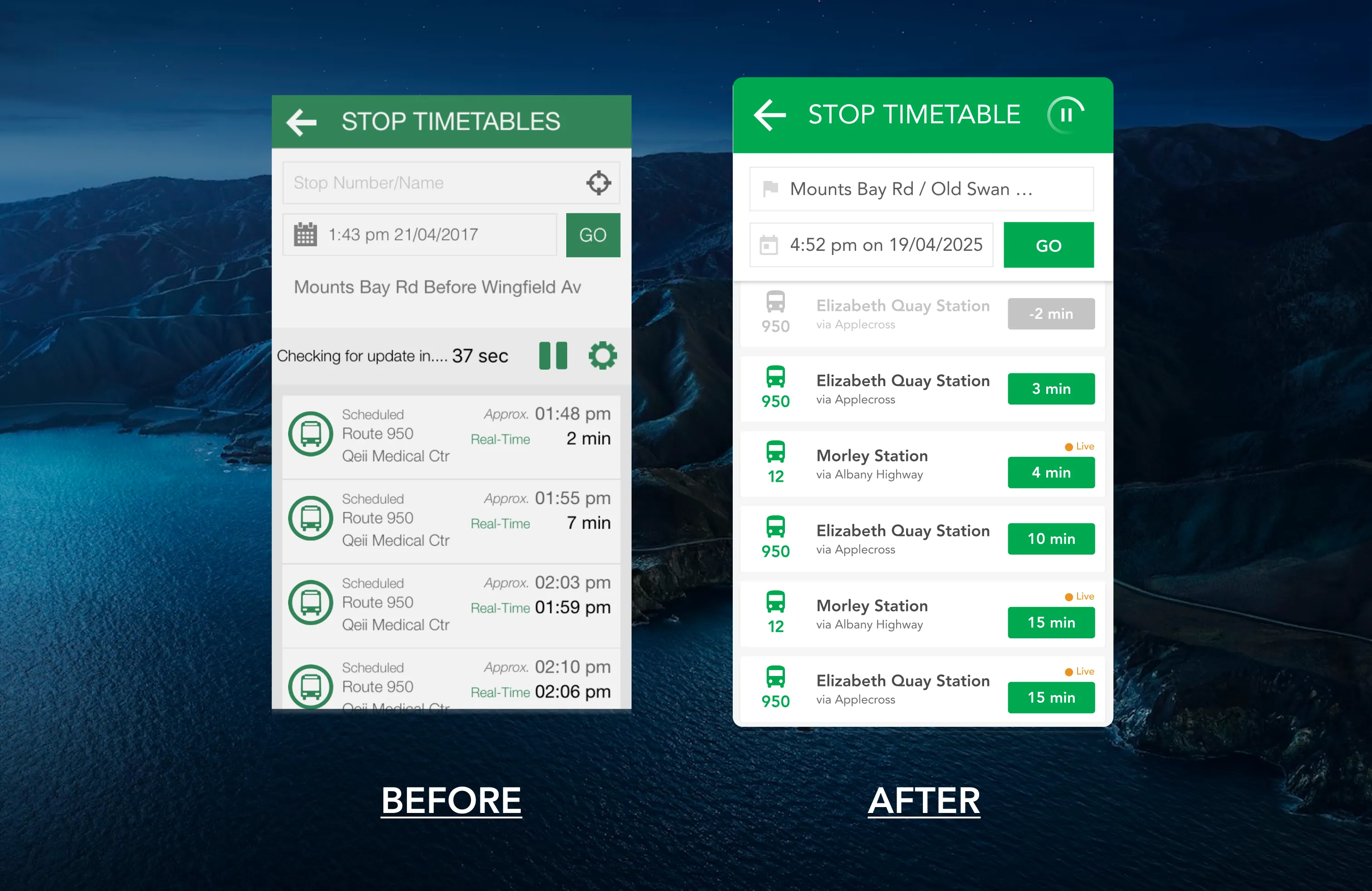
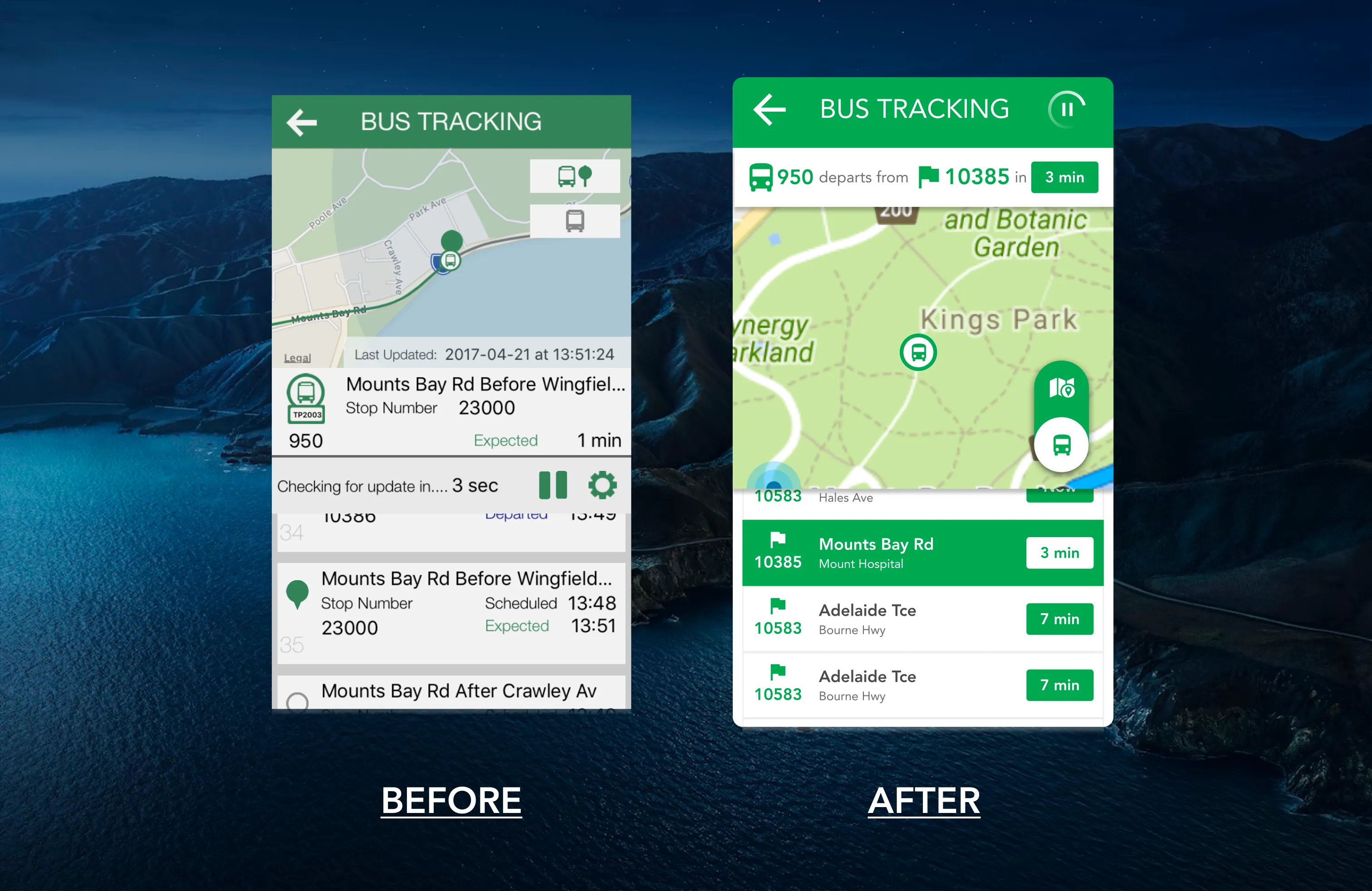
Saving space and attention
The app suffered from TMI. When all elements are shouting, none are heard. This problem exacerbated by the generalness of the userbase, the limited screen real estate on mobile device, and the time-sensitive, distraction-full context this app has to work in. Any doubt in the UI could mean a missed connection, and an embarrassing late arrival.
To combat this, I reduced the UI down to its bare essential, and reasserted a new visual hierarchy using clear, consistent colour, iconography, and type.
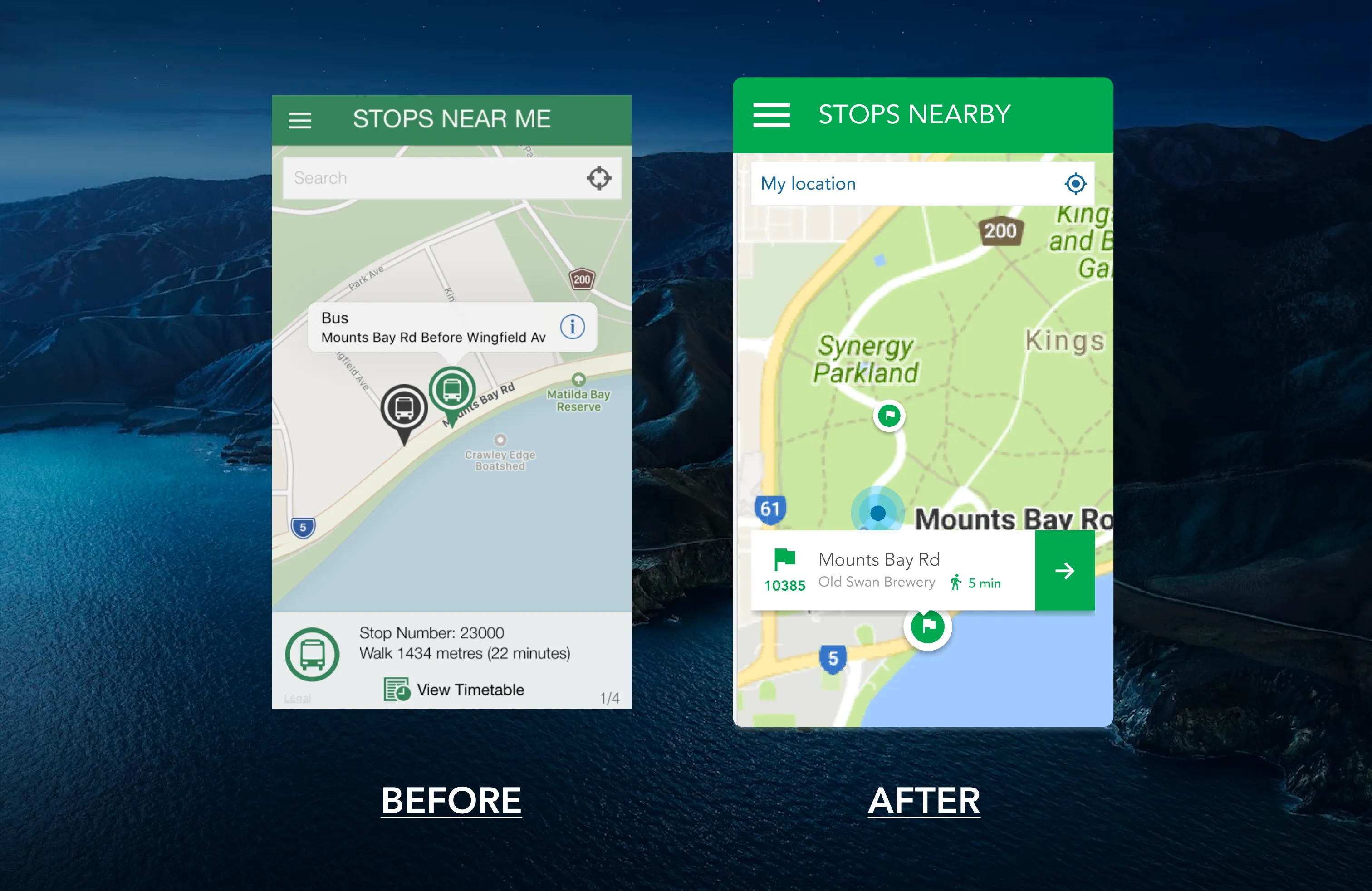
A UI facelift like this not only improves UX, and a marketable perceived usefulness, it’s a solution that requires minimal developer lift.
Extensibility & modularity
The design was also built in a way to help the app scale to support future needs like new modes of urban mobility: trains & ferries, and new features like realtime stop alerts.
The team had guardrails like the symbol framework, and room-to-play with the simple component library, so they could grow the design themselves.
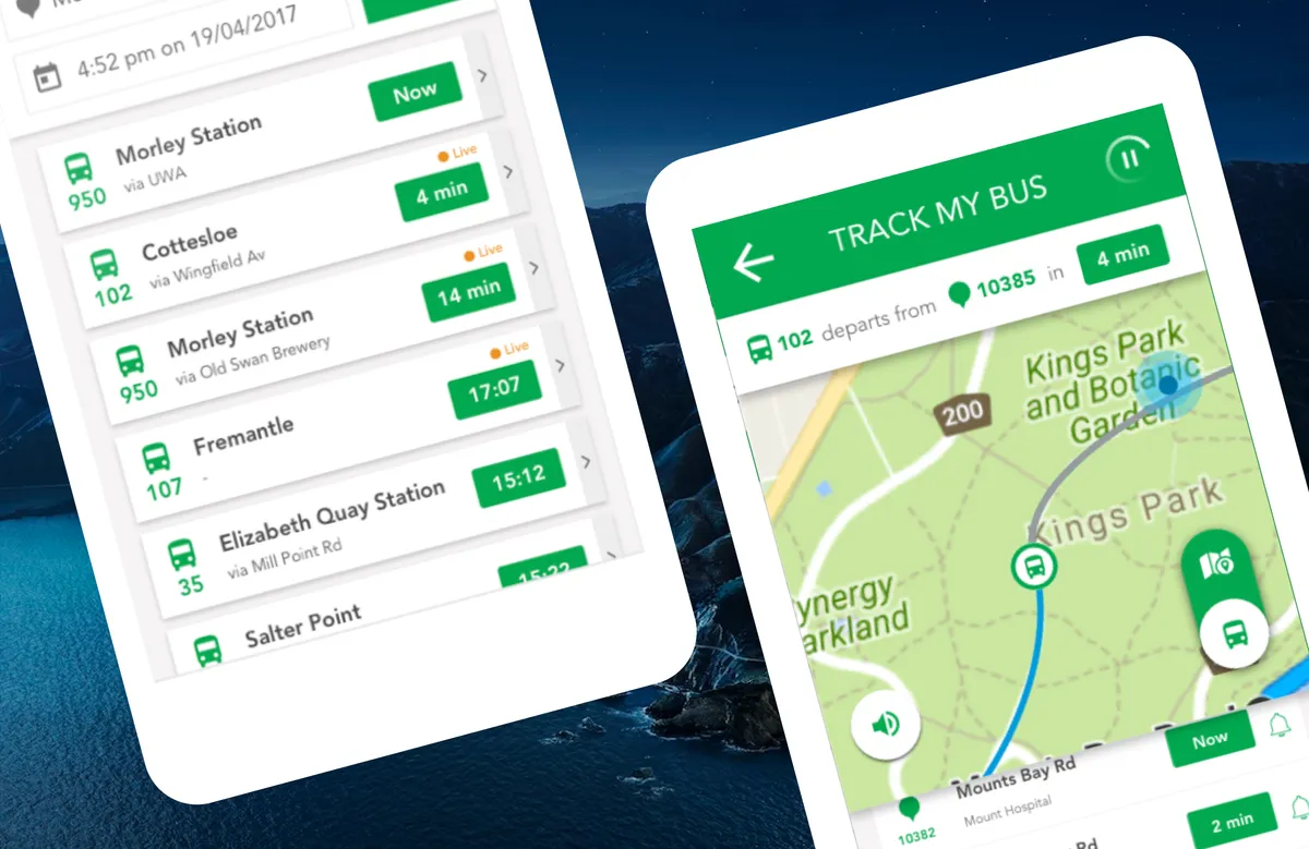
Live updates
Due to earlier versions of the app being largely being static, and opaque with its sync status, there was little trust from users that information in-app reflected the latest events. Additionally, real-time syncing on mobile devices posed real battery drain possibility for users - that we needed to help them manage.
The blinking indicator on connections, paired with the revolving timetable sync, are simple, recognisable cues to the apps newfound, live intelligence. Additionally, the sync’s pause/play mechanism, ensures that users are in control of their battery.
Validation
Given cost and privacy constraints that prohibited external user testing this time; we de-risked design errors via means of rapid internal usability testing and expert review, field testing, and incremental design delivery. Some outcomes include:
- +42% (13/15) increase in task completion. A before and after internal design usability test revealed 4 additional test users were able to plan a multi-leg trip without assistance.
- 60% drop in post-release ux change/bug reports than usual. The early and frequent testing meant we could arrest critical usability problems before code was shipped, and save on rework costs.
- experiential issues like screen readability in sunlight, battery performance, and accessibility were surfaced in field testing and resolved by the final design
Retrospective
- Learning #1: Internal User Testing is better than no user testing, and in B2C contexts, arguably more valuable than external user testing since it’s free, fast, and a great team sport.
- Learning #2: Sometimes you’ll have to
submitadapt to the project delivery model of the company, rather than force the new/latest/best model. In this case, Waterfall was preferred over agile, which meant i could get creative, and incite agility and regular delivery in how i showed up and involved stakeholders.