Summary
Business Case
Kadoa is an AI-powered web scraping platform. Investment firms use it to extract structured data from public websites at scale — no code required, just describe what you need in plain language. The platform’s multi-agent system handles navigation, forms, and extraction. The data feeds real-time trading models, where minutes matter and bad data costs millions.
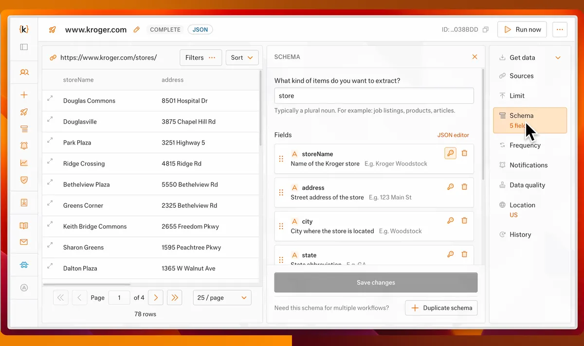
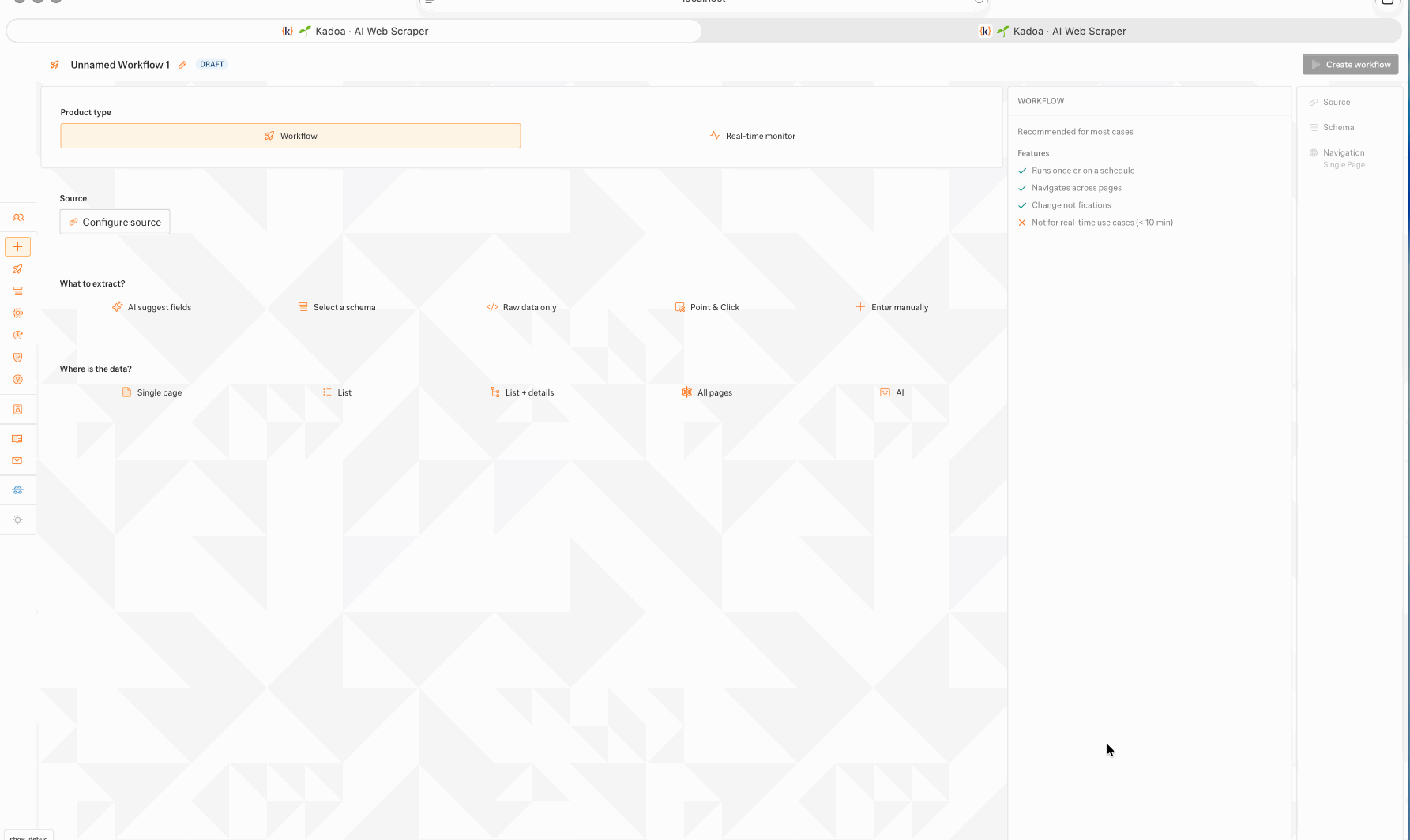
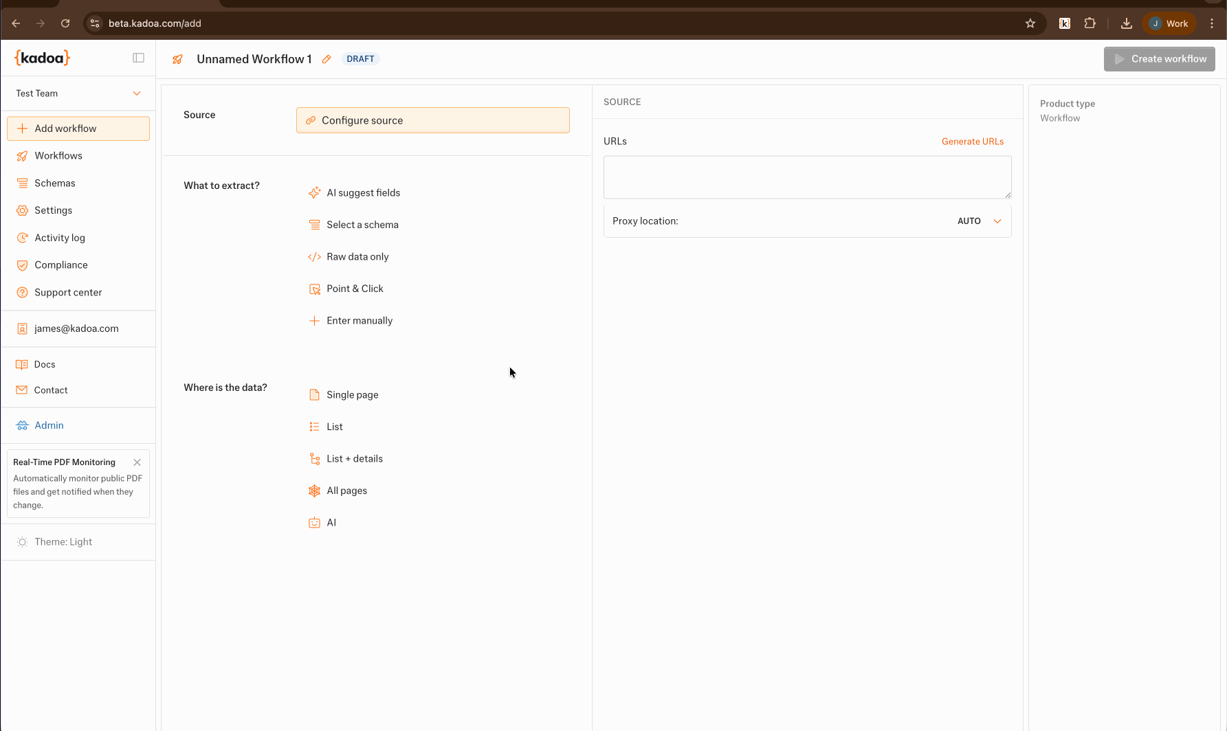
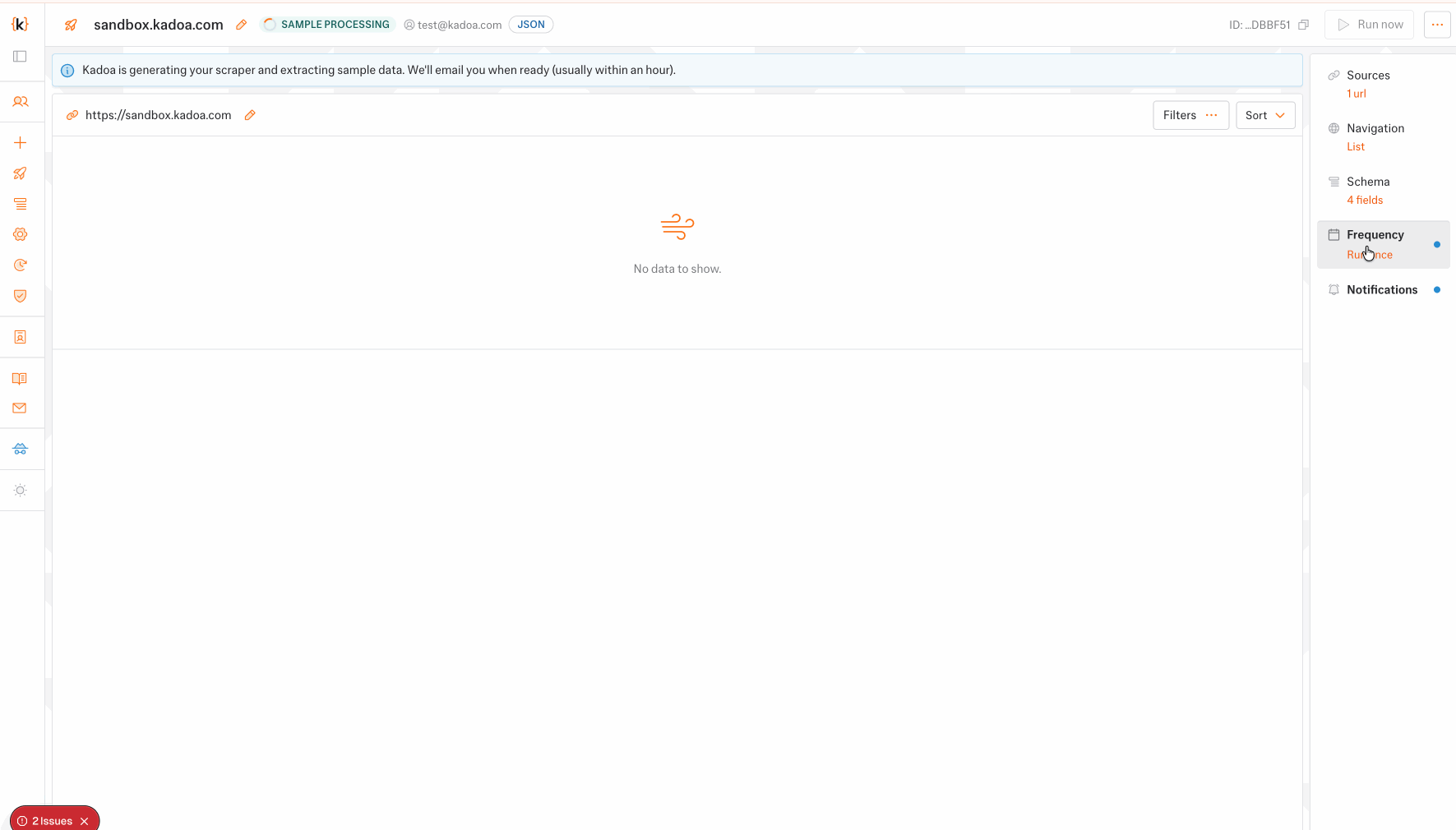
The workflow setup wizard is the product’s front door. Tens of thousands of users interact with it daily. It touches every backend service. A workflow has three parts: source URL, schema (which entities and fields to extract), and navigation mode. Setup takes 10 minutes to an hour. Get it wrong, start over from scratch.
The problem: the product had grown powerful, the setup experience hadn’t kept pace. We’d bolted on features in a rush — new steps, new options, new branches — without rethinking the flow. UX debt compounded. Customer complaints rolled in: the setup process had regressed, took too long, and felt broken.
My Role
I owned the product — not just the project. From research to production code, this was mine to shape. While the company had 2 other frontend developers, they weren’t involved. I was the solo designer and developer on this.
- Research: Desk research on key accounts, customer calls, persona development, journey mapping.
- Design: Wireframes, documentation, interaction patterns — the full wizard redesign.
- Code: Built the frontend in React, TypeScript, Tailwind, and Radix UI. Wrote automated e2e tests to protect critical paths.
- Product integration: Wove a new product line (crawling mode) into the existing setup flow without breaking the experience.
- Testing & iteration: Ran internal alpha and external beta programs, gathered feedback, iterated.
The company couldn’t afford outages on this journey — it generates over 1M ARR. Quality and testability were non-negotiable.
User Profile
Data engineers and analysts at investment firms — hedge funds, quant trading desks, private equity shops. Technical users who know what they want and don’t tolerate friction.
They’re under time pressure. Market data loses value by the minute. A misconfigured scraper means lost data, missed trades, and starting the entire setup over from scratch. For workflows that feed seven-figure trading strategies, errors aren’t inconvenient — they’re expensive.
These users don’t want hand-holding. They want precision, speed, and tools that get out of their way.
Project Journey
Started with research. Studied key account patterns, parsed support tickets, mapped the existing journey. Then customer calls — talking to power users about what worked and what didn’t.
I don’t get your new updates from a user perspective, you went from 3 clicks to create a workflow to 15+ I liked the simplicity of pasting my url and having everything run on autopilot. i don’t need to configure everything, especially as it’s going to be the same for most workflows — User Support Ticket Insight Sample
The pattern emerged fast: the wizard was a black box. Users couldn’t see their progress, couldn’t jump between sections they’d finished, couldn’t update a workflow without starting over. The linear next/back structure that worked early on now worked against expert users who needed flexibility.
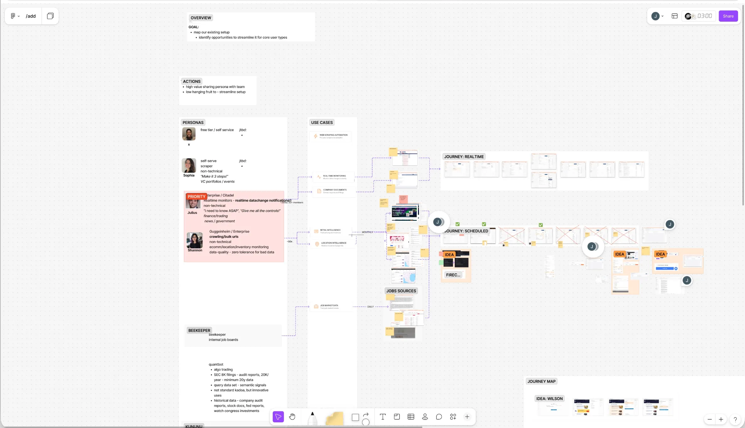 Personas, Journey Mapp, and Pluralistic Walkthroughs
Built and tested. Internal alpha first, then external beta with customers. This is where it got interesting.
The business wanted a compact, innovative UI. Compress all 8 steps into a single, dynamic module — visually distinctive, a departure from the familiar multi-page form. I prototyped it. It answered the brief perfectly: radical reduction in navigation, everything visible at once, modern and sleek.
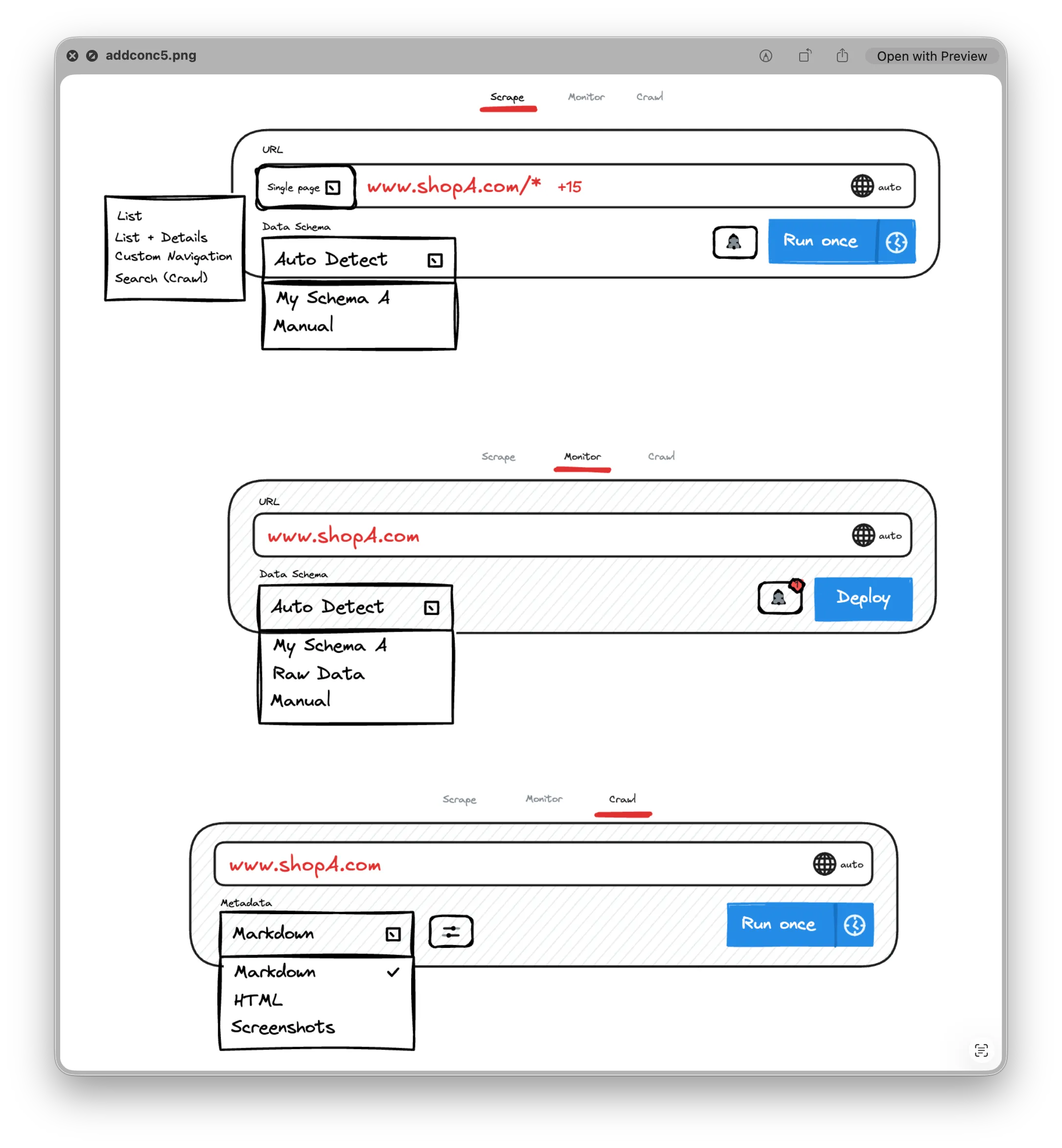 Wireframe concept for the compact module
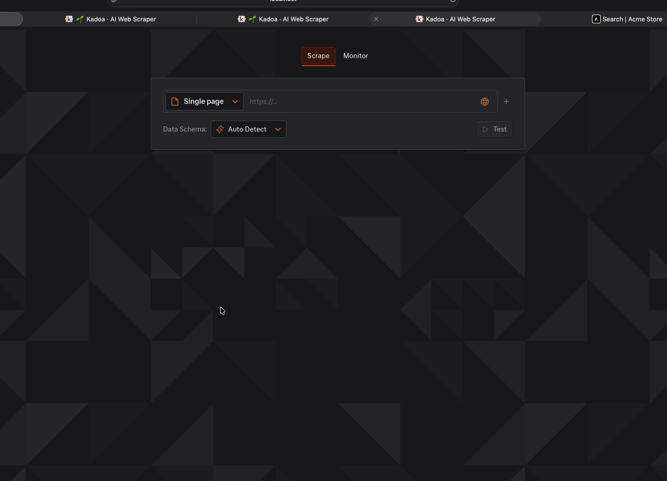 Coded prototype in dark mode
I tested it. Users hated it.
Too different from the existing flow. The relearning cost was too high. And implementing it would’ve required a full frontend rewrite — throwing out working code for a design nobody asked for. Users didn’t want impressive; they wanted fast and familiar.
So I pivoted. Kept the existing mental model but made it work better. Less friction, more visibility, fewer required steps. KISS won.
Some of the many prototypes developed and tested.
Design Solution
The redesign made four moves: fix navigation, make settings editable, cut required steps, and surface what users were missing.
Linked Table of Contents
Old wizard: next, back, next, back. A tunnel. You couldn’t see your progress, couldn’t jump ahead, couldn’t go back without losing your place.
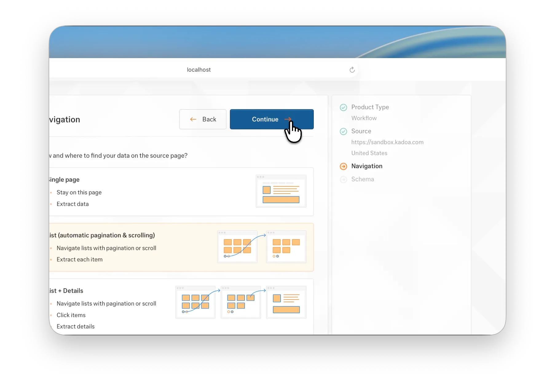
New wizard: persistent, linked table of contents. Jump to any section. See what’s done, what’s left, what’s optional. Cross-reference between settings — because workflows aren’t linear. Schema affects navigation. Navigation affects extraction. Users need to move fluidly between them.
This also killed the anxiety of “how much more is there?” — a pain point that came up in every customer call.
Editable Workflow Settings
Settings were read-only. Change your mind? Start the entire setup over. 10 minutes to an hour, wasted. For production workflows scraping live data, this was brutal.
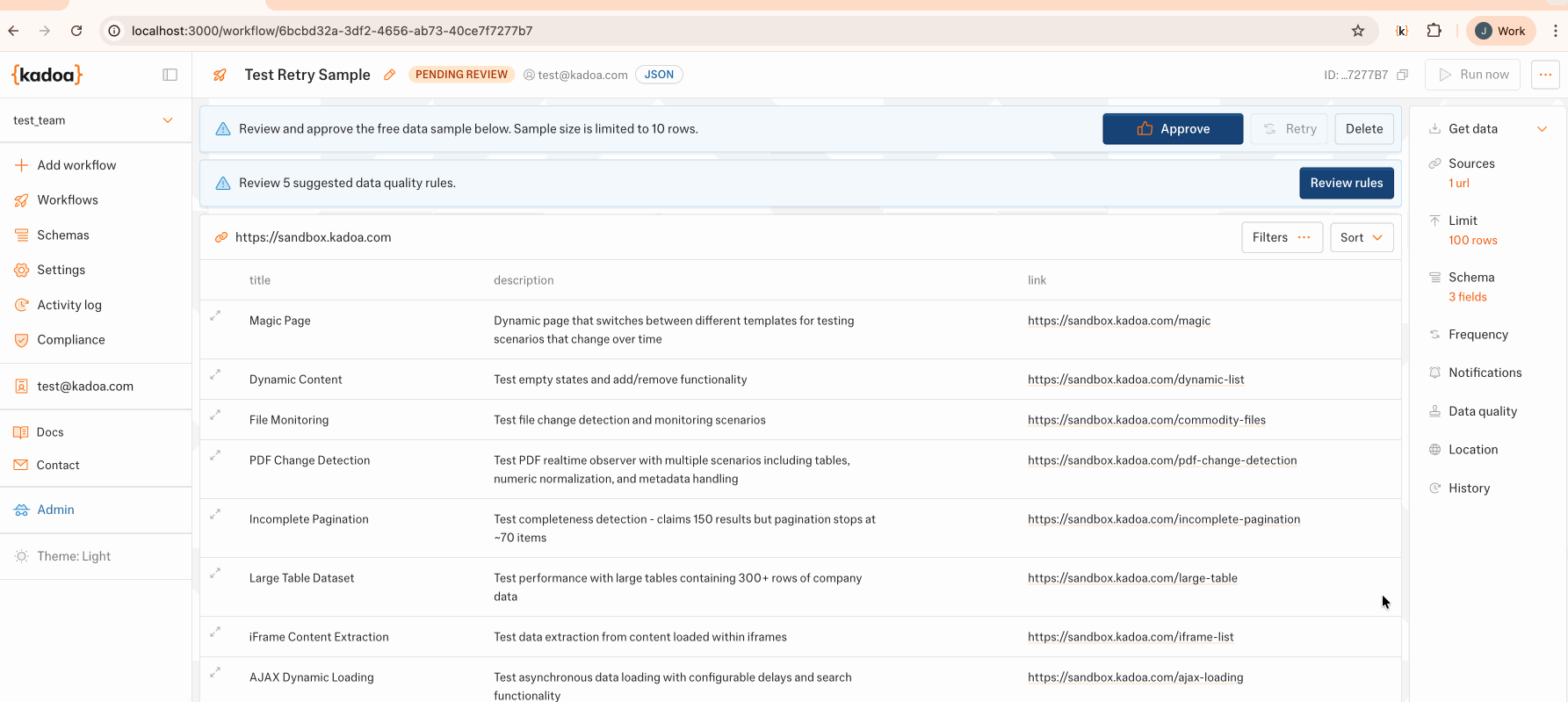
I made settings editable. Now users can update configuration, resample extraction, iterate and refine their scrapers over time. Mental model shift: from “get it right the first time” to “start, test, improve.” That’s how expert users actually work.
But making settings optional created a new problem: users would forget to configure them, then complain their workflow was broken. We needed to make them aware of what they’d missed before publishing.
Unvisited Settings Indicator
First idea: a “publish workflow” confirmation dialog that summarized meta settings (name, schedule, extraction limits). Classic pattern. Also additive, interruptive, and UX-jarring.
Better solution: a pulsing indicator on unvisited menu items. Subtle, non-blocking, elegant. It makes its presence known without stopping you. Encourages discovery of optional settings without forcing a modal in your face. Users stay in flow, but they don’t forget critical configuration.
Minimal code, maximum impact.
Streamlined Setup
Analysed the existing flow. 4 of the 8 steps were optional — but the linear wizard treated them as mandatory gates. Every user, every time, forced through screens they didn’t need.
Restructured the flow. Optional steps now run in parallel in the background, loaded only when relevant. Result: 50% reduction in minimum required steps. This is the journey that generates 1M+ ARR for the company — cutting friction here mattered.
Users reach their first extraction result faster. Perceived speed of the whole process improved.
Validation & Impact
Shipped to production. Replaced the old wizard on day one — no gradual migration, no A/B test. Full adoption immediately.
- Setup steps cut in half (8 → 4) by parallelizing optional configuration. 50% reduction on a journey that generates 1M+ ARR annually.
- 3,000 lines of frontend code removed while adding 3 new features: crawling mode, editable settings, and extraction resampling. Smaller codebase, more capabilities.
- Build and test times measurably faster. Leaner code meant faster CI/CD cycles — critical with only 2 frontend engineers maintaining the platform.
- Customer complaints stopped. The “setup regressed” feedback that triggered this project disappeared after launch.
- New product line integrated seamlessly. Crawling mode — a major new capability — absorbed into the setup flow without breaking existing mental models or adding friction.
Retrospective
- Learning #1: When the business pushes innovation and users ask for familiarity, listen to the users. KISS isn’t settling — it’s strategy. Users under time pressure will choose familiar patterns executed well over flashy interfaces that demand relearning. Reducing friction beats adding features.
- Learning #2: Owning design and code isn’t just efficient — it changes what’s possible. Parallel loading optional steps? That decision only surfaces when you understand both the UX problem and the code architecture. The 3K-line reduction wasn’t cleanup; it was a design choice that came from seeing the whole system.